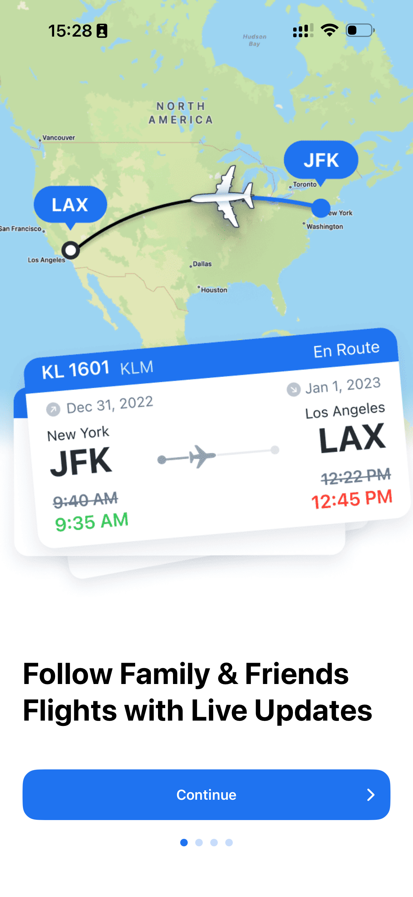
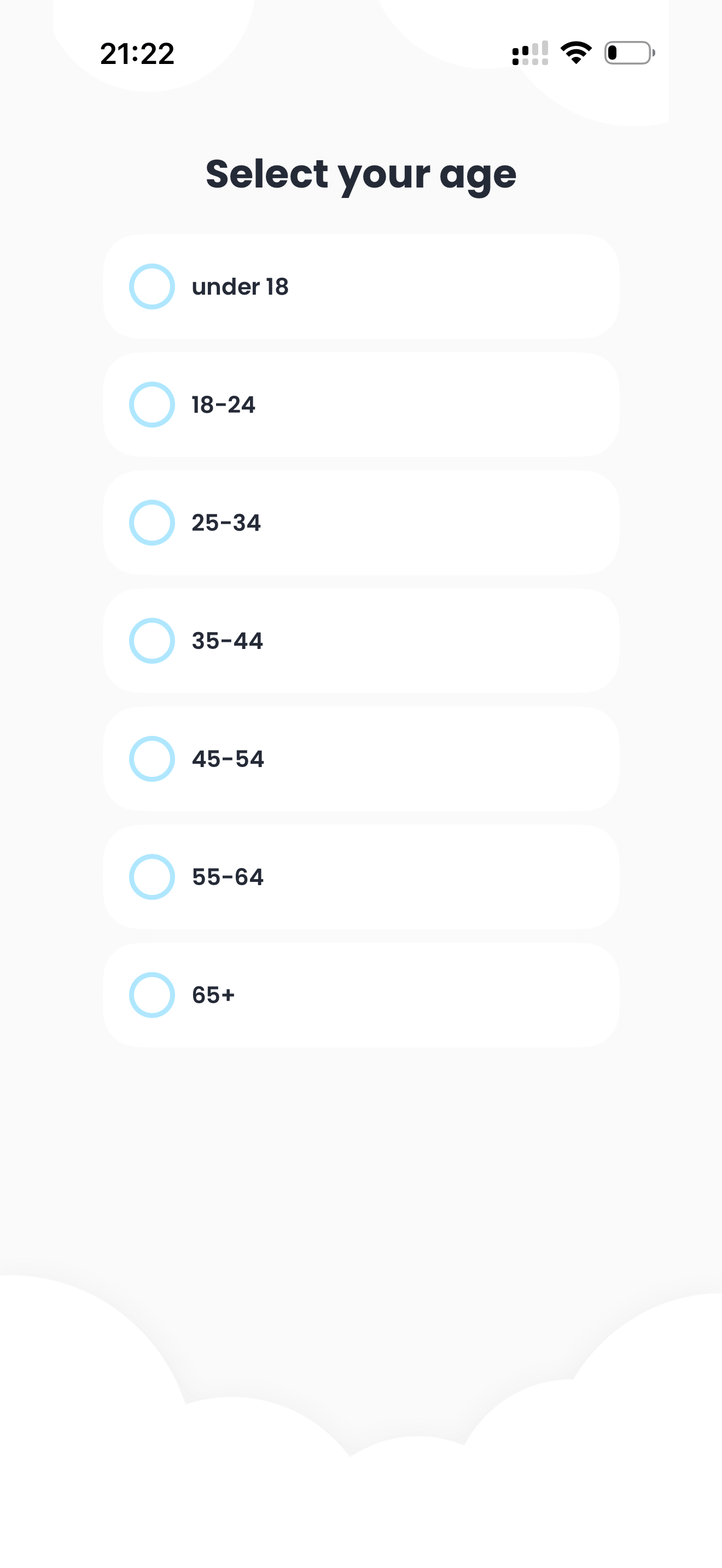
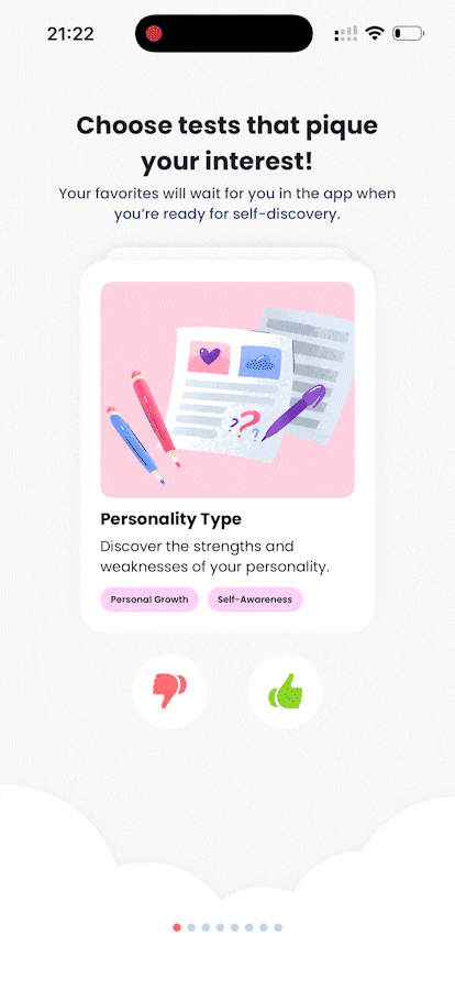
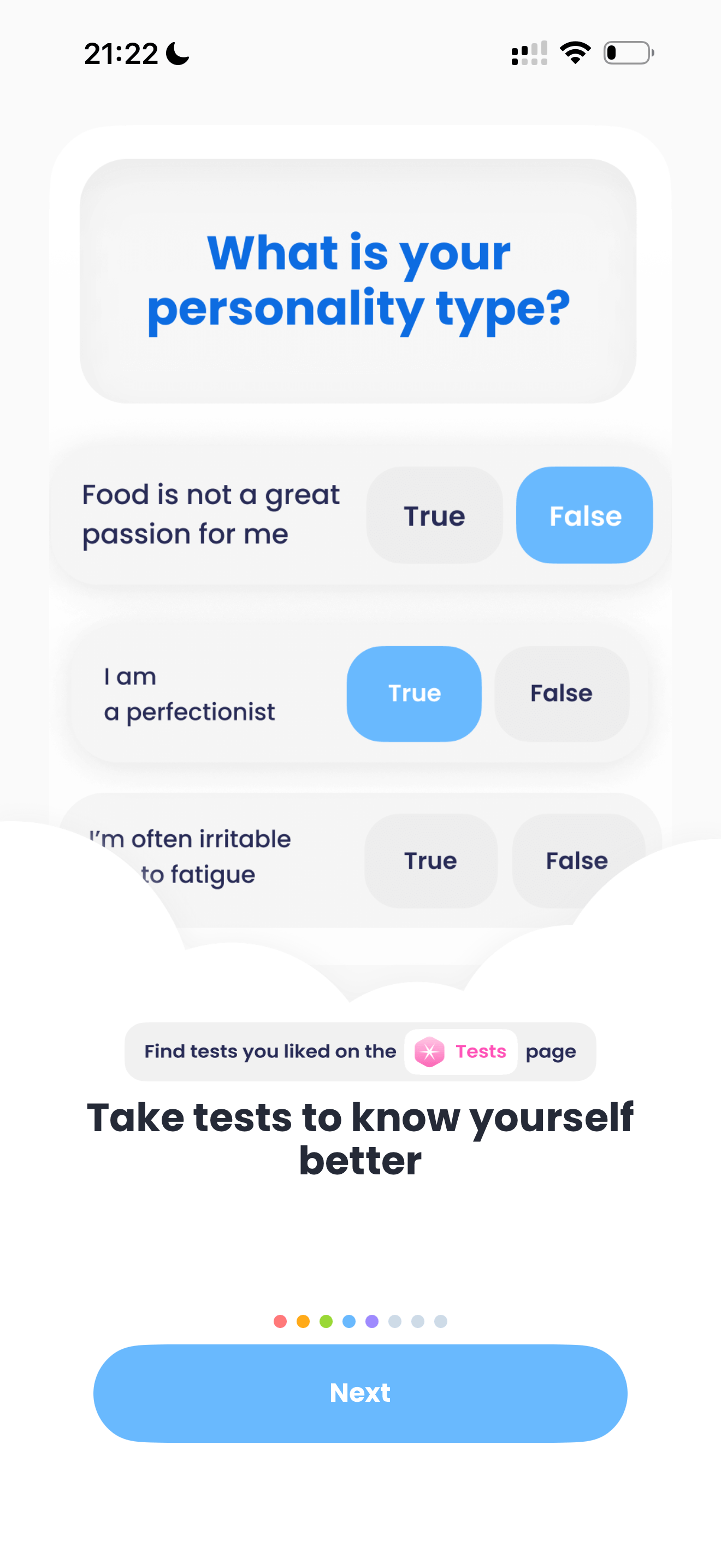
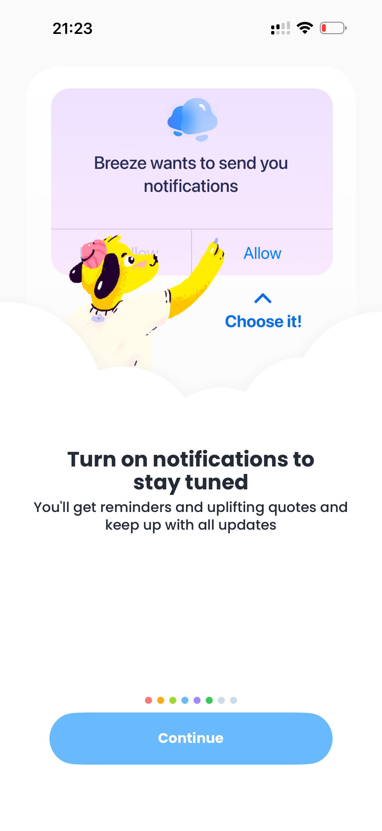
Back to Analysis Hub
Onboarding December 28, 2025

A really well-thought-out onboarding, but… what was it actually about?

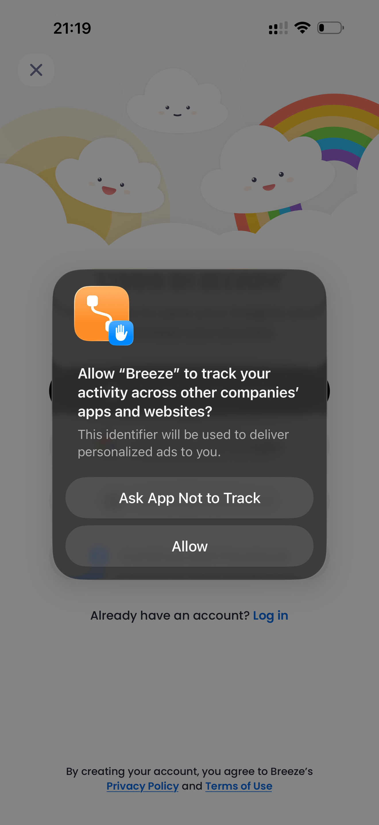
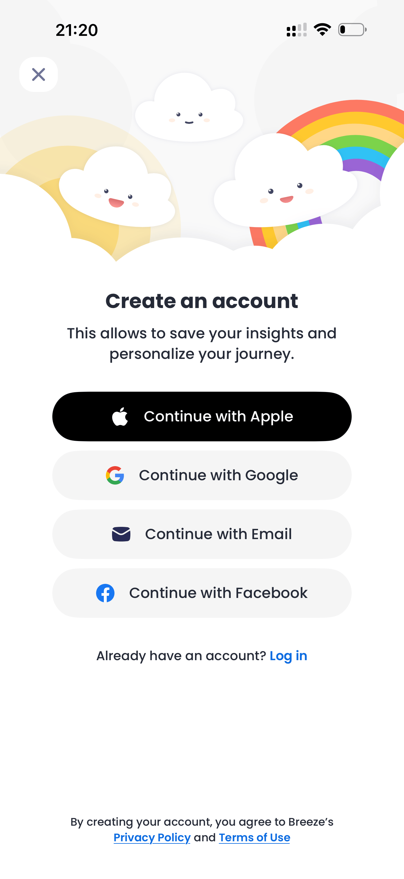
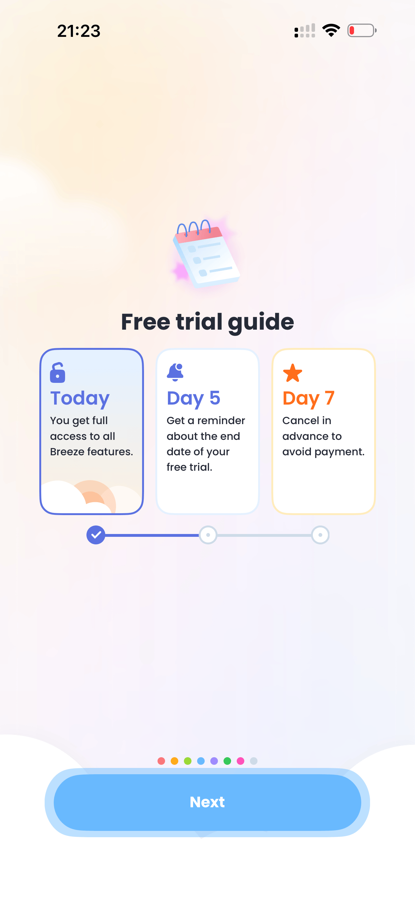
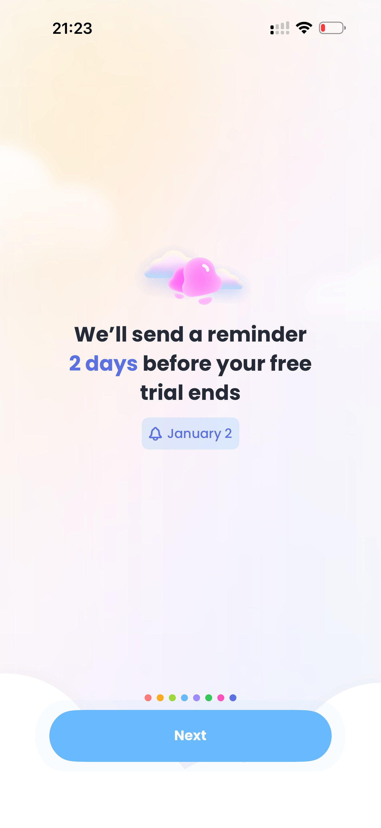
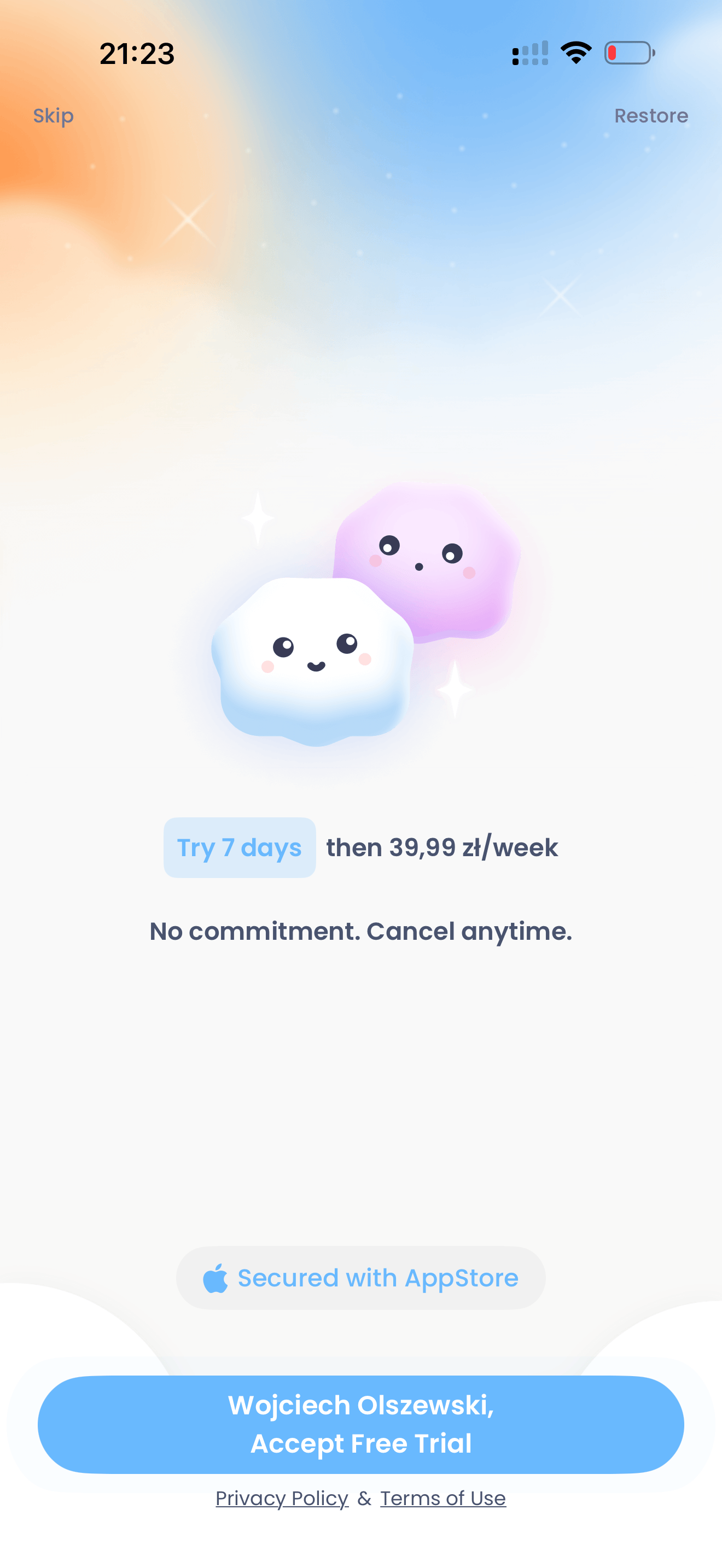
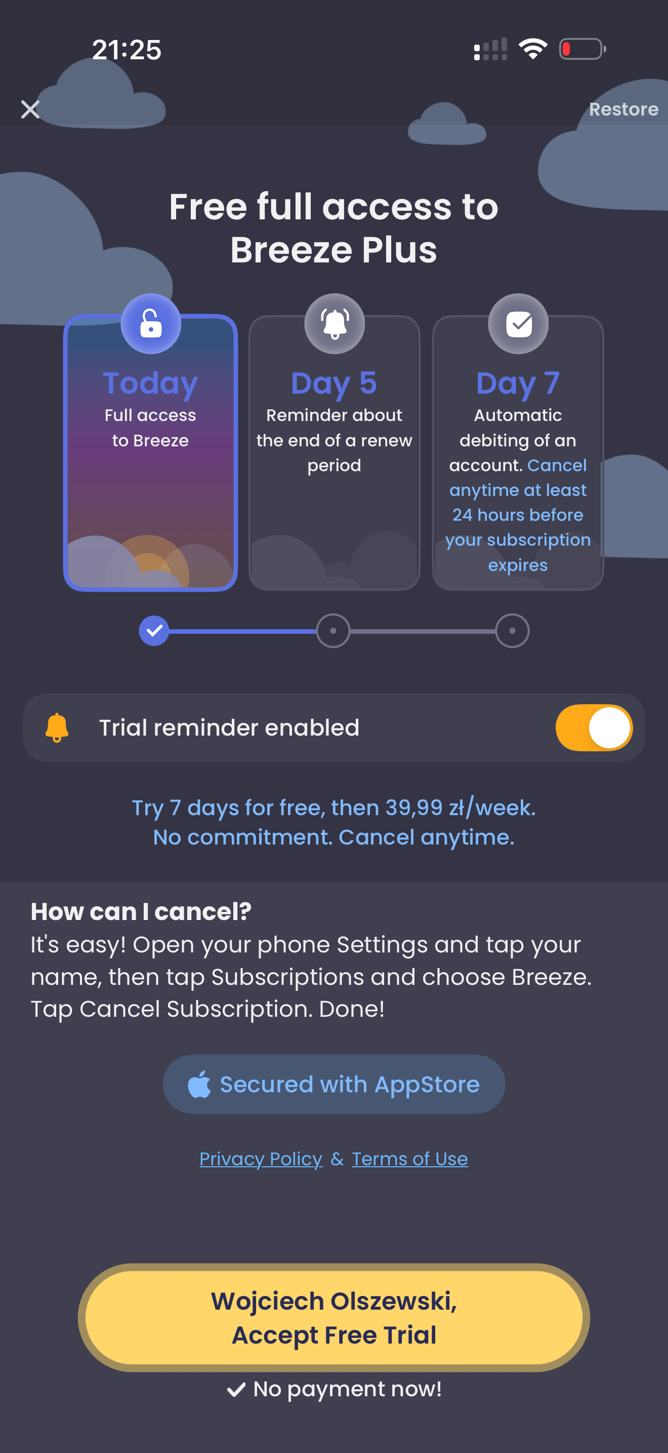
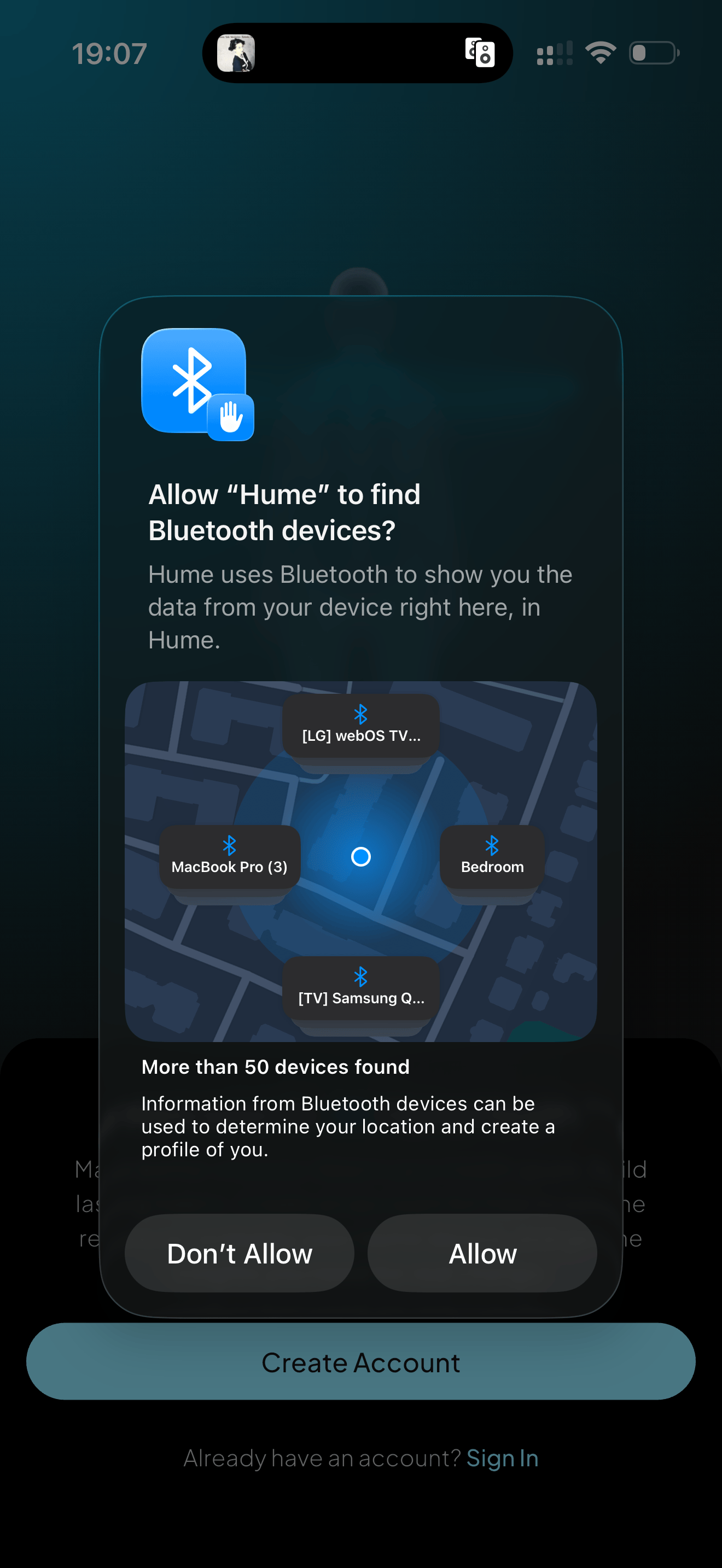
The onboarding is visually polished and thoughtfully designed, with some genuinely enjoyable moments, but it introduces too much friction too early. Key permissions, account creation, and pricing appear before the app clearly explains its value, which creates confusion and weakens trust. By the time the user finally sees a concrete plan and understands what the app actually does, they’ve already been asked to commit, pay, and invite friends—making the experience feel well-executed, yet poorly sequenced.

Breeze: Start Self-Discovery Icon

Breeze: Start Self-Discovery

Basenji Apps

Lifestyle Free 4.6

Global Performance

au # 88
Top Grossing
Lifestyle
br # 48
Top Free
Lifestyle
br # 27
Top Grossing
Lifestyle
ca # 97
Top Grossing
Lifestyle
ch # 99
Top Grossing
Lifestyle
fr # 55
Top Grossing
Lifestyle
in # 94
Top Grossing
Lifestyle
it # 71
Top Grossing
Lifestyle
mx # 70
Top Free
Lifestyle
mx # 50
Top Grossing
Lifestyle
no # 71
Top Grossing
Lifestyle
pt # 100
Top Free
Lifestyle
pt # 48
Top Grossing
Lifestyle
se # 72
Top Grossing
Lifestyle
us # 78
Top Grossing
Lifestyle
Analysis screenshot 1
1
As always, this is not something I want to see right after the first app launch, when I don’t yet trust the app. There’s no technical reason to request this immediately on first open. 👎🏻
Analysis screenshot 2
2
No what? Is it time to create an account or tap the “X” in the top-left corner? Let’s go with that.
Analysis screenshot 3
3
Name? Thanks to SwiftUI and simple text field attributes like :textContentType(.name):, I can fill this field with a single tap.
Analysis screenshot 4
4
I get it—it’s useful for future acquisition segmentation and internal analysis—but I don’t think this is needed so early.
Analysis screenshot 5
5
Tinder-like interest selection: I love it. It’s fun, familiar, and matches interaction patterns users already know. A great screen that actually makes me enjoy using the app.
Analysis screenshot 6
6
I don’t understand this screen. It feels like a placeholder—there’s only an illustration and no real content. It’s a letdown right after such an enjoyable previous screen. The only action is “Next.”
Analysis screenshot 7
7
Another screen encouraging me to allow push notifications. This isn’t the right place to ask for permission without proper context.
Analysis screenshot 8
8
First real friction: the free trial. Okay, I’ll start the trial—but it immediately signals that the app isn’t free. That said, I do appreciate the notification reminding me about the upcoming conversion from free trial to paid access.
Analysis screenshot 9
9
I already understood this one screen ago, but for some users this repetition may help reduce anxiety.
Analysis screenshot 10
10
Third screen in a row about the free trial—and here comes the second friction: price. It’s relatively high (~$11/week), comparable to Netflix, but at this point I honestly don’t know what I’m paying for. Do you even remember what this app is about? Let’s tap “Skip” for now.
Analysis screenshot 11
11
And then the magic happens. I finally get a plan for today—something concrete. My first task as a user? Share a 30-day free access with a friend. Brilliant idea for driving installs and potential paid users. One more friction from the user’s perspective, though: why does my friend get a better deal than I did?
Analysis screenshot 12
12
Since I’m not a PRO/premium user, some features are locked. Let’s open the paywall.
Analysis screenshot 13
13
Same elements, slightly different design. I really like using my name on the button, the system-like toggle with a reminder about the free trial ending (even though the toggle isn’t clickable), and the “Secured with App Store” label. However, the subscription price is so subtle that I had to search for it for a few seconds.
WO

Analysis by Wojciech Olszewski

I work with mobile apps, focusing on marketing, monetization, and product decisions. I'm interested in how things work in practice — not just how they're described in best practices. Through InApp.Center, I share observations and analyses based on real app experience.

© 2025-2026 AppWiso. All rights reserved.